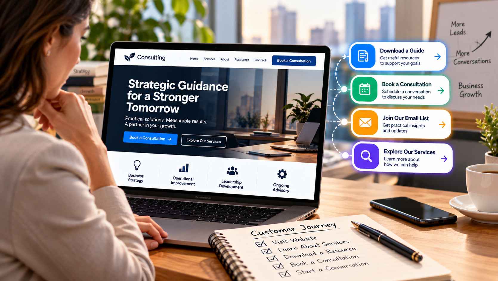
A professional service website often has a harder conversion job than an online store. A visitor may not be ready to buy anything immediately. They may be comparing consultants, researching an unfamiliar service, trying to understand whether a problem can be solved, or simply looking for useful information.
That makes the next step important. A website should not force every visitor into a sales conversation, but it should make an appropriate next action easy to find.
Calls to action, or CTAs, can help create that path. A consultant might invite a visitor to book a consultation, while an agency could offer a guide, an advisor could request an assessment, and a coach could invite someone to join an email list. The right CTA depends on what the visitor knows, what they need, and how ready they are to engage.
Why Professional Service Websites Need a Clear Next Step
Professional services are often built around trust and conversation. A potential client may need to understand the provider’s expertise, approach, services, and suitability before making contact.
Without a clear next step, visitors can consume several pages of information and still leave without knowing what they should do next.
A CTA provides direction without necessarily being aggressive. “Book a Consultation” is appropriate when someone is ready to talk. “Explore Our Services” may make more sense for a visitor who is still learning. “Download the Guide” can give a researcher a useful reason to continue the relationship.
This makes CTAs part of the customer journey rather than simply decorative buttons.
Match the CTA to the Visitor’s Intent
One of the most useful ways to improve CTA strategy is to consider visitor intent.
Someone reading a detailed article about business succession planning may not be ready to hire an advisor. Asking that person to schedule a consultation immediately could be premature. A downloadable checklist or email subscription may be a more appropriate step.
By contrast, a visitor who has reached a dedicated service page, reviewed the process, and looked at frequently asked questions may be closer to making contact.
Professional service websites can therefore benefit from having different CTA types for different stages.
Early-stage visitors might see:
- Download a Guide
- Subscribe for Updates
- Read the Related Resource
Mid-stage visitors might see:
- Explore the Service
- View Our Approach
- See How It Works
Later-stage visitors might see:
- Book a Consultation
- Request an Assessment
- Contact Our Team
- Request a Quote
The wording should be specific enough that visitors understand what will happen after they click.
Use Low-Commitment CTAs for Early-Stage Visitors
Not every visitor wants to talk to a salesperson or consultant on the first visit.
A lower-commitment CTA can give someone a useful way to continue without asking for a major decision.
For example, an accounting firm could offer a tax-planning checklist. A business consultant could provide a planning worksheet. A coach could invite visitors to join an educational email series where appropriate. An agency could offer a practical guide related to a common client problem.
These actions can support a longer customer journey.
They also help businesses recognize that conversion does not always mean an immediate sale. An email signup, resource download, or visit to another relevant service page can be a meaningful step when the visitor is still evaluating options.
Make Consultation and Contact CTAs Easy to Find
When someone is ready to talk, the website should not make them search for the contact option.
A consultation button can appear in the main navigation, near relevant service information, and after sections that answer common questions. A contact option can also remain visible on mobile devices, where visitors may be using a phone to make the initial inquiry.
The CTA should clearly describe the action. “Book a Consultation” tells the visitor more than a generic “Submit” button.
The destination matters too. If the CTA promises a consultation, the next page should make it easy to understand how the consultation works and what information is needed.
For professional services, reducing uncertainty can be just as important as reducing the number of clicks.
Give Different Services Their Own Conversion Paths
A consultancy, agency, or advisory firm may have several services aimed at different problems or customer types. Sending every visitor toward the same generic contact page can create unnecessary friction.
A consulting firm might have separate pages for strategy consulting, operational improvement, and leadership advisory. Each page can have a CTA that relates specifically to that service.
A visitor interested in operational consulting could be invited to “Discuss Your Operations Challenge,” while someone researching strategy services might see “Book a Strategy Consultation.”
This approach gives the visitor context and helps the business understand why the person is making contact.
It can also improve the quality of the conversation because the initial inquiry already indicates the visitor’s area of interest.
Keep the Website Experience Helpful Rather Than Pushy
More CTAs do not automatically create a better customer journey.
A page crowded with competing buttons can make it difficult to identify the main action. A professional service website should establish a hierarchy: one primary action for the page, supported by secondary options where they genuinely help.
For example, a service page might make “Book a Consultation” the primary CTA while offering a quieter “Download Our Guide” option for visitors who are not ready to speak with someone.
Placement should also feel natural. A CTA after a section explaining the service can make sense because the visitor has just received information relevant to the decision. A CTA inserted after every paragraph can feel repetitive.
The goal is to help people move forward, not pressure them into an action they are not ready to take.
Managing Multiple CTAs on WordPress
As a professional service website grows, managing different CTAs across dozens of pages can become difficult. A business may have different offers, service pages, resources, forms, and audience segments, each requiring a slightly different next step.
WordPress users can use a tool such as WP CTA Pro to manage calls to action without having to create a separate custom development solution for every variation.
A centralized CTA approach can be useful when a website needs multiple actions across different pages. It can also make ongoing updates easier because the business can adjust CTA content or placement as its services and marketing priorities change.
For example, an agency could use one CTA style for consultation requests, another for downloadable resources, and another for newsletter signups. The important point is to keep each action connected to the page’s purpose.
A WordPress call-to-action plugin can be especially useful when a business wants to maintain consistent CTA elements while still adapting the action to different parts of the website.
Connect CTAs to a Broader Marketing Strategy
A CTA should not be planned in isolation from the rest of the marketing strategy.
The U.S. Small Business Administration recommends defining a target market, sales plan, marketing goals, actions, budget, and methods for measuring results as part of a marketing plan. Its guidance also emphasizes considering the steps a customer takes after deciding to buy. SBA marketing plan guidance
For a professional service business, this means thinking about what happens before and after the click.
If a campaign promotes a consultation, the landing page should support that offer. If an article is designed to educate early-stage prospects, its CTA might point toward a useful resource rather than immediately requesting a sales call.
Businesses can also review which CTAs generate meaningful actions and adjust them over time. A high number of clicks is not necessarily useful if the resulting inquiries are poorly matched to the service.
Build a Clear Path From Interest to Conversation
A professional service website does not need to turn every visitor into a lead immediately.
Instead, it should make the next useful step clear.
Some visitors will want to book a consultation. Others will need more information first. Some may want to explore a service, download a resource, or simply understand the business better before deciding whether to make contact.
A thoughtful CTA strategy gives each of these visitors a reasonable path forward.
When the wording, placement, and destination all match the visitor’s intent, calls to action become more than conversion elements. They become navigation tools that help potential clients move through the decision-making process with less uncertainty.
The strongest approach is simple: understand what visitors need at each stage, give them a useful next step, and make the path from interest to conversation feel natural.